The rayshader library is an open-source package developed by Tyler Morgan-Wall for the programming language R. I had recently been coming across a handful of high-quality 3D plots of different U.S. states using rayshader. Population density maps have been one of the most popular use cases involving rayshader.
My experience with 3D plotting is still very limited compared to 2D plotting but was something I was encouraged to try after learning that such high-quality graphics could be made with R, a language I had some level of familiarity with. Previously, I had used Esri’s ArcMap in a limiting capacity for terrain mapping. Rayshader requires some level of familiarity with R and data visualization with packages such as ggplot2. While the barrier to entry is likely lower using a graphical interface such as ArcMap, Morgan-Wall’s package makes a significant contribution to a space that was previously vacant.
Practitioners can create high-quality 3D renders that aren’t reliant on a single tool or license. Similar open-source packages exist such as OpenGlobus and CesiumJS for JavaScript and Kepler.gl which offers robust 3D visualization capabilities. Rayshader, for example, allows developers already familiar with R to easily create 3D representations of their 2D graphs. This is benefitted further by the expansive availability of mapping and visualization packages already available in R.
I previously mentioned seeing population density maps of a few U.S. states, but not one of an entire country. Spencer Schien, a data analyst provides a very thorough tutorial for creating a population density map of Florida. As I reviewed his instructional material, I realized Schien had the advantage of an R package called Tigris which provides population shapefiles for U.S. states. Unfortunately, there isn’t a comparable package available for countries.
Schien has done an exceptional job of 3D-mapping most of the U.S. states on his website, however, I knew I had to find another approach to start on my project of plotting Ukraine’s population density. A good amount of the shapefiles I encountered were specifically for Esri applications. I was able to find compatible shape files from Kontur which provides population density datasets.
Getting the shape file to work was likely the most challenging part of the process. The rest of the process involved looking over the rayshader documentation as well as Schien’s tutorials and trying different settings to see what works best.
The rayshader package works by creating an interactive 3D model of the plot which can be viewed from different angles before the plot graphic is rendered. This allows for seamless changes in all types of settings such as volumetric lighting, shadow depth and intensity, and color palettes. After changes are made, low-resolution graphics are rendered and assessed for quality before creating a high-resolution output.
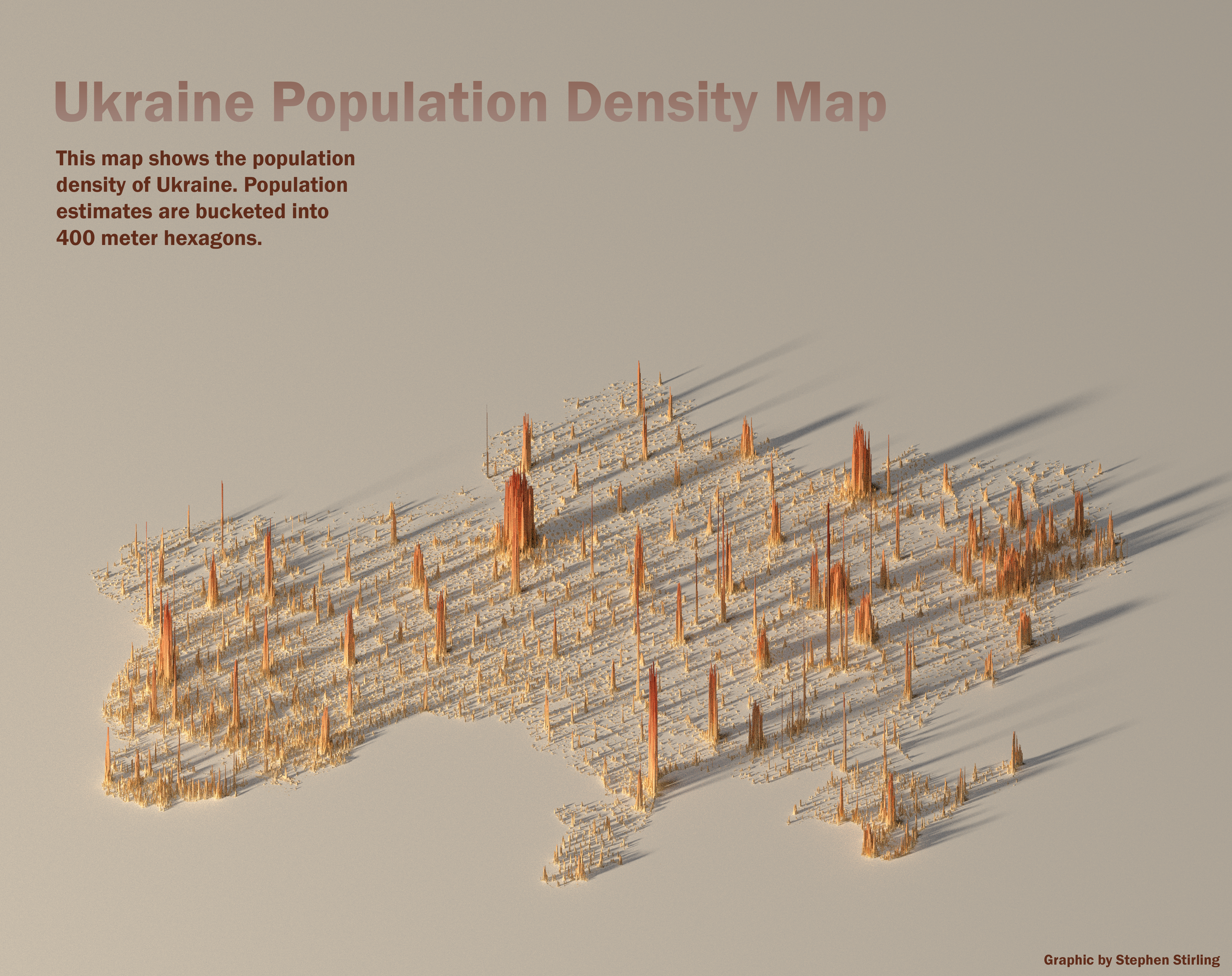
This map uses Ukrainian population data as of 2022. It should be noted that this data represents figures before the exodus and internal migration caused by the full-scale invasion in February of 2022.
Comments