
Background
Having been living in eastern Ukraine with the Peace Corps for nearly eighteen months, I have become increasingly accustomed to first-hand accounts of the stories shared by soldiers fighting on the frontline in the Donbas region. During my time here, I have worked at a community-based organization that supplies soldiers and veterans with services and medical products the government has been unable to provide. The stories of our service members tell a tale of hardship that can only fully be understood through first-hand experience. There is a deep sense of pride and patriotism amongst the servicemembers. The sentiment impressed upon me is vaguely reminiscent of the themes expressed in Erich Maria Remarque’s All Quiet on the Western Front. I want to share a footnote from that book that sums up the camaraderie soldiers felt in the trenches of World War I, “This book is to be neither an accusation nor a confession, and least of all an adventure, for death is not an adventure to those who stand face to face with it. It will try simply to tell of a generation of men who, even though they may have escaped shells, were destroyed by the war.”
The Challenge
This article aims to simultaneously provide a real-world data visualization scenario while also taking a data-driven approach to storytelling. Unlike the previous Ukraine-centered articles using CSV sheets from web portals, this assignment required a significantly higher degree of creativity and web scouring.
I would like to acknowledge the contribution of a recently returned Peace Corps volunteer, Ben Stewart who helped considerably with the research area of this post. His findings are documented in a similar recent post.
Storytelling
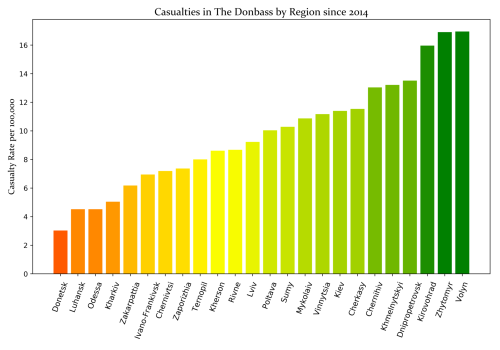
The war in the Donbas region has been ongoing since April 2014, coinciding with the Euromaidan movement which saw the installation of a new government. The required data for this graph was not available in an intuitive or easily accessible format. A website called the Ukrainian Memory Book (in Ukrainian) catalogs the deaths of Ukrainian soldiers on the frontline since the conflict began. To create the visualization below, I compiled the number of military casualties and grouped them by oblast to contrast that figure with the respective oblast population. This formula resulted in a ratio of deaths per 100,000 residents. I used the Matplotlib Python library to create this chart.
While this graph does not show absolute numbers, I believe it creates a better perspective by accounting for population. This is significant because the two oblasts where the conflict is occurring, Donetsk and Luhansk, have the lowest casualty-to-population ratio.
In addition to the societal burden incurred by injured and deceased soldiers, the hardships and experiences of internally displaced persons (IDP) is a frequent cause of concern and discussion. The UN Refugee Agency compiles data on the number of registered IDPs by oblast. Their data, reported by the Ministry of Social Policy, only appeared accessible in the form of a bar chart without reference to the source. To perform analysis on this data, I compiled a new Excel spreadsheet for interpretation with Tableau.
Using Tableau Desktop, I created a geocoded dashboard of registered IDPs by oblast. This visual representation tells a different story than that of the casualties. The numbers displayed below are also calculated at a ratio of 1 IDP per 100,000 residents. This time, however, the two oblasts most affected are Donetsk and Luhansk even despite their relatively low populations. This ultimately is not surprising, as over 10% of their populations have been displaced. The actual amount is likely significantly higher, as the data represented only includes registered numbers.
import matplotlib.pyplot as plt

import numpy as np

import pandas as pd

from matplotlib.pyplot import figure

import matplotlib.colors as mcolors

sheet = pd.read_excel("Raw Graphs for Visualizing.xlsx") cfont = {'fontname': 'Constantia'}

df = pd.DataFrame({"x" : sheet.RatePer100k})

def plot_bar_x():

plt.figure(figsize=(10,7)) cmap = mcolors.LinearSegmentedColormap.from_list("", ["red", "yellow", "green"]) plt.bar(sheet.Region, sheet.RatePer100k,

color=cmap(df.x.values/df.x.values.max()))

plt.xlabel("Oblast", fontsize=5, labelpad=12)

plt.ylabel('Casualty Rate per 100,000',**cfont, fontsize=12.5)

plt.xticks(sheet.Region, fontsize=11, rotation=70)

plt.title('Casualties in The Donbass by Region since 2014',

**cfont, fontsize= 15)

plt.tight_layout()

plt.savefig('DonbassCasualties.png', dpi=500)
While this graph does not show absolute numbers, I believe it creates a better perspective by accounting for population. This is significant because the two oblasts where the conflict is occurring, Donetsk and Luhansk, have the lowest casualty-to-population ratio.
In addition to the societal burden incurred by injured and deceased soldiers, the hardships and experiences of internally displaced persons (IDP) is a frequent cause of concern and discussion. The UN Refugee Agency compiles data on the number of registered IDPs by oblast. Their data, reported by the Ministry of Social Policy, only appeared accessible in the form of a bar chart without reference to the source. To perform analysis on this data, I compiled a new Excel spreadsheet for interpretation with Tableau.
Using Tableau Desktop, I created a geocoded dashboard of registered IDPs by oblast. This visual representation tells a different story than that of the casualties. The numbers displayed below are also calculated at a ratio of 1 IDP per 100,000 residents. This time, however, the two oblasts most affected are Donetsk and Luhansk even despite their relatively low populations. This ultimately is not surprising, as over 10% of their populations have been displaced. The actual amount is likely significantly higher, as the data represented only includes registered numbers.
.png)
The war in Donbas coincided with the ascension of Petro Poroshenko as the new Ukrainian president. He has overseen the war from the beginning and his approval ratings have varied throughout that time. During the data discovery step, I found polling numbers to be readily available. To create the next graph, I looked at time-based data gathered since early 2016. During this time, Ukraine has been at war and the economy has not shown significant growth. Consequently, Poroshenko’s approval rating has suffered considerably, never crossing the 20% threshold. The data displayed in the graph below is an aggregate of several different polls.
The next presidential election in Ukraine is scheduled for next month on the 31st. While Poroshenko has long been mentioned as a formidable contender, other names have been mentioned since at least 2015. One of his strongest competitors is Yulia Tymoshenko, the leader of the All-Ukrainian Union “Fatherland” political party. Tymoshenko, a former prime minister, is noted for having a considerably more friendly stance toward Russia than Poroshenko. Her name was the only other one that has been consistently mentioned as a presidential front running going back to January 2016. She has enjoyed generally better poll numbers than the current president, and increasingly so over the past year.
Another presidential hopeful, Volodymyr Zelensky, began appearing high in opinion polls in early 2018. Zelensky is an aspiring politician and a screenwriter by trade. He gained recognition for running as a populist and has expressed an openness to communicate with Moscow as a means for ending the war in Donbas.
The presidential election comes at an uncertain and perilous time. The new leader will be responsible for ending the war, closer integration with the EU and presumably increased aggression from Russia.
import pandas as pd

import altair as alt

import numpy as np

np.random.seed(42)

alt.renderers.enable('notebook')

data = pd.read_excel("Presidential Poll.xlsx", "Sheet1")

df = pd.DataFrame(data)

line = alt.Chart(df).mark_line().encode( x='Time', y='mean(Percentage)', color='Candidate', detail='index:N', opacity=alt.value(0.5) ).properties(width=700)
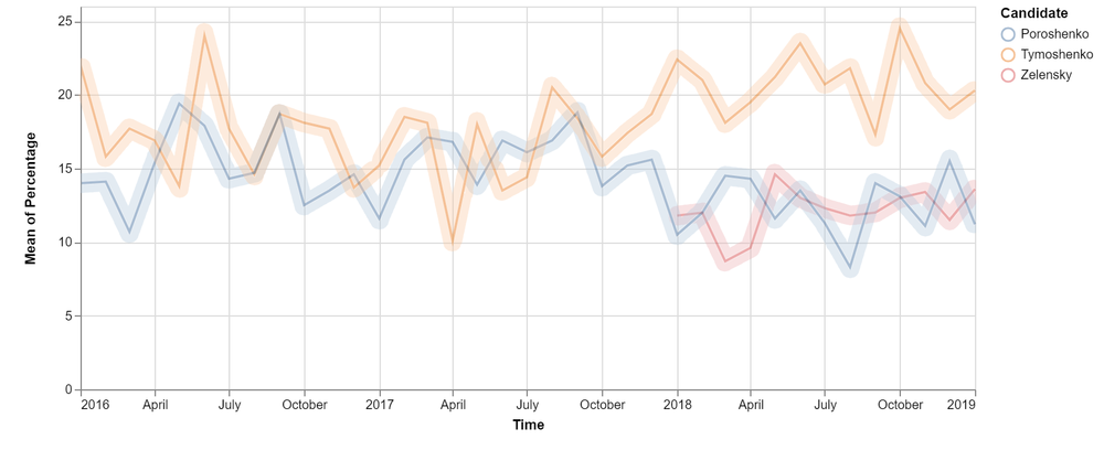
The graph above was created using the Altair declarative statistical library for Python. This was my first time working with Altair, however, it offered an intuitive and robust approach to visualization.
While none of Ukraine’s leading presidential prospects have enjoyed high favorability in opinion polls, the country’s parliamentary popularity is not far behind. In late 2017, the Center for Insights in Survey Research published a report finding exceptionally low approval ratings. The polling data showed the “Strongly Approve” and “Somewhat Approve” categories of parliamentary performance were consistently the lowest two categories with the former never rising above six percent.
The poll shows data from early 2014, around when the conflict began, through the end of 2017. This is significant; despite the actions of the government, the vast majority of Ukrainian citizens expressed strong disapproval of the performance and direction of their parliament. Ukraine is expected to hold parliamentary elections in the fall.
import plotly.plotly as py

import plotly.graph_objs as go

import plotly.figure_factory as ff

import pandas as pd

import numpy as np

import matplotlib.pyplot as plt

import numpy as np

xls = pd.ExcelFile("Public Opinion Raw Data.xlsx") poll = pd.read_excel(xls, "Slide13")

strongly_approve = go.Scatter( x = poll.Time, y = poll.StronglyApprove, mode = 'markers', name = 'Strongly Approve', marker = dict( size = 11, color = '#28B463', opacity = .85, line = dict(width = 1))

) somewhat_approve = go.Scatter( x = poll.Time, y = poll.SomewhatApprove, mode = 'markers', name = 'Somewhat Approve', marker = dict( size = 11, color = '#F7DC6F', opacity = .85, line = dict(width = 1))

) somewhat_disapprove = go.Scatter( x = poll.Time, y = poll.SomewhatDisapprove, mode = 'markers', name = 'Somewhat Disapprove', marker = dict( size = 11, color = '#E67E22', opacity = .85, line = dict(width = 1))

) strongly_disapprove = go.Scatter( x = poll.Time, y = poll.StronglyDisapprove, mode = 'markers', name = 'Strongly Disapprove', marker = dict( size = 11, color = '#B03A2E', opacity = .85, line = dict(width = 1))

)

data = [strongly_approve, somewhat_approve, somewhat_disapprove, strongly_disapprove] layout = go.Layout(title = 'Approval Ratings of Ukrainian Parliament, 2014 - 2018', xaxis = dict(title = 'Month and Year'), yaxis = dict(title = 'Percentage'))

fig = go.Figure(data = data, layout = layout)

py.iplot(fig, filename='scatter-mode')
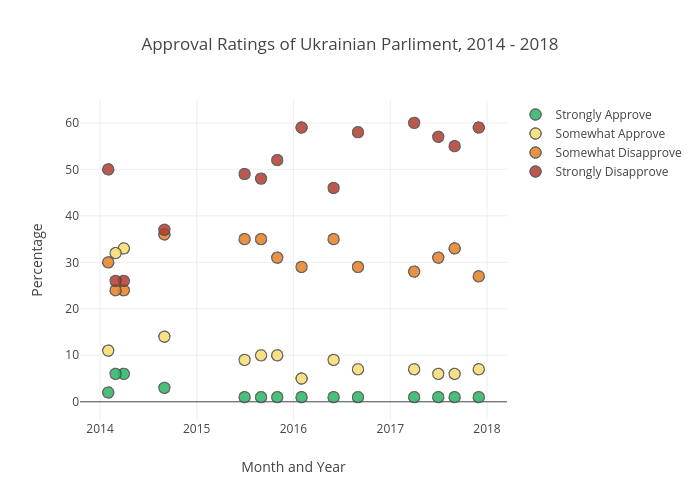
To best represent the poll numbers over a timespan, I decided to return to Plot.ly. This Python library offers interactive visualizations which provide more detail than static images. Unfortunately, LinkedIn does not allow for embedded code, but by clicking on the image you will be redirected to an interactive version.
2019 is a significant year for the future of Ukraine both because of the elections but also because of an increased need to navigate turbulent geopolitical waters. The same report from the Center for Insights also conducted opinion polls regarding the stance of Ukrainians joining international organizations. Further integration with Europe and other western countries has been an ongoing issue that has recently picked up support. When officially, launching his second presidential bid, Poroshenko announced that Ukraine would submit a formal application to the EU for membership consideration by 2024.
import numpy as np

import seaborn as sns

from matplotlib import pyplot as plt

eu = pd.read_excel("EU Poll Raw Data.xlsx")

eu.head(50)

sns.set_style("darkgrid")

sns.lmplot(x="Time", y="Poll", data=eu, hue='Type', fit_reg=False ,legend=False, palette="Dark2")

plt.legend(loc='lower right')

plt.title("Ukrainian Public Opinion \n Polling on Joining the EU and NATO", fontsize=18)

plt.ylabel('Approval Rating', fontsize=12)

plt.xlabel('Year', fontsize=12)

plt.tight_layout()

plt.savefig('EUpoll.png', dpi=500)
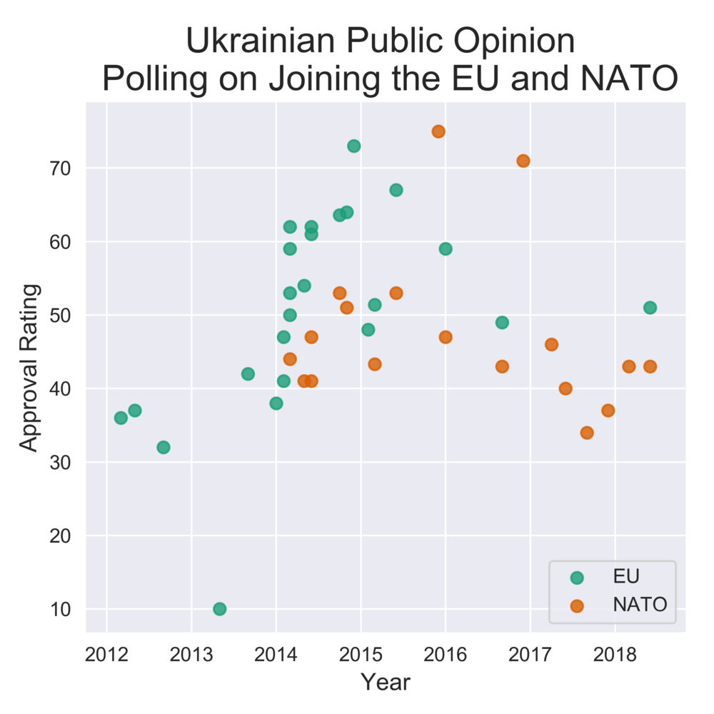
The graph above was created using the Seaborn library. Seaborn expands the feature set of Matplotlib but also allows for slightly better-looking graphs in my opinion.
None of the data represented in this post came from traditional or easily accessible datasets. This process required significant data wrangling and processing to prepare for visualization. This is to be expected in the course of working as a data scientist.
Comments