The United Nations estimates nearly 70% of the world’s population will be living in urban areas by 2050. Living in cities has obvious benefits such as public transportation infrastructure, attractions, shopping, and access to medical services. Conversely, disadvantages include increased costs of living, noise, light pollution, and limited space. Data science provides us with a multitude of methods to quantify the pros and cons of urban dwellings. The process allows us to make informed decisions using insights gleaned from the analytical process.
For this week’s article, I sought to determine whether cities offer increased safety when compared to rural areas. If this were to be the case, I next wanted to know which countries offered the safest cities. I arrived at this concept after completing a thorough comparison of different datasets. Instead of working backward from the narrative to the data, I decided to build a story around data. The data source used in this article contains more than 180,000 records. This provides more than ample information to create a narrative and derive meaningful insights.
The first step in attempting to answer the question of safety by city and country requires choosing the right indicators. This conclusion was determined by the available data. Kaggle is well known in the data science realm for maintaining a plethora of datasets ranging from wine reviews to baseball statistics. I selected the Global Terrorism Database, a comprehensive dataset maintained by the University of Melbourne’s National Consortium for the Study of Terrorism. The database contains detailed information about casualties, motivations, perpetrators, and geographical information.
The next step involved reading the Excel sheet with Python in a Jupyter Notebook. This particular dataset includes different levels of geographic indicators. To establish which countries had the highest rates of terrorist attacks, I decided to group by region. This was done using a Python package called Altair. This visualization library offers a robust feature set and impressive visuals.
import matplotlib.pyplot as plt

import pandas as pd

from collections import Counter

import numpy

data = pd.read_excel("globalterrorismdb_0718dist.xlsx")

region_list = data['region_txt'].tolist() country_list = data['country_txt'].tolist()

outer_group = [] for x in region_list: if x not in outer_group: outer_group.append(x)

Counter(region_list) region_amount = Counter(region_list)

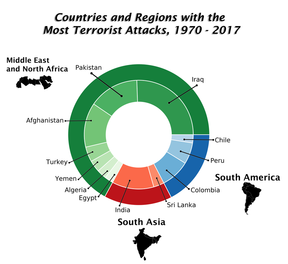
outer_group_sizes = [64596, 14982, 16767] outer_names = ['Middle East & North Africa', 'South Asia', 'South America']

inner_group = [] for x in country_list: if x not in inner_group: inner_group.append(x)

country_amount = Counter(country_list) country_amount.most_common()

inner_group_sizes = [24636, 14368, 12731, 4292, 3347, 2743, 2479, 11960, 3022, 8306, 6096, 2365] inner_group_names = ['Iraq', 'Pakistan', 'Afghanistan', 'Turkey', 'Yemen', 'Algeria', 'Egypt', 'India', 'Sri Lanka', 'Colombia', 'Peru', 'Chile']

a, b, c, = [plt.cm.Greens, plt.cm.Reds, plt.cm.Blues]

fig, ax = plt.subplots() ax.axis('equal') mypie, _ = ax.pie(outer_group_sizes, radius=1.3, labels = outer_names,labeldistance = 1.5, colors = [a(0.8), b(0.8), c(0.8)] ) plt.setp( mypie, width=0.3, edgecolor='white')

mypie2, _ = ax.pie(inner_group_sizes, radius=1.3-0.3, labels = inner_group_names, labeldistance = 1.4, colors=[a(.7), a(.6), a(.5), a(.4), a(.3), a(.2), a(.1), b(.5), b(.4), c(.5), c(.4), c(.3)])

plt.setp( mypie2, width=0.4, edgecolor='white') plt.margins(0,0) plt.savefig('fig1.png', dpi = 700) plt.show()

The image above contains countries belonging to the three regions with the highest amount of terror attacks. Notably, France, the United Kingdom, and the United States, among others are excluded due to the comparatively low numbers of attacks in their respective regions. Instead of using raw numbers, this visual gives an idea of where attacks most often occur and identifies the biggest regional contributors.
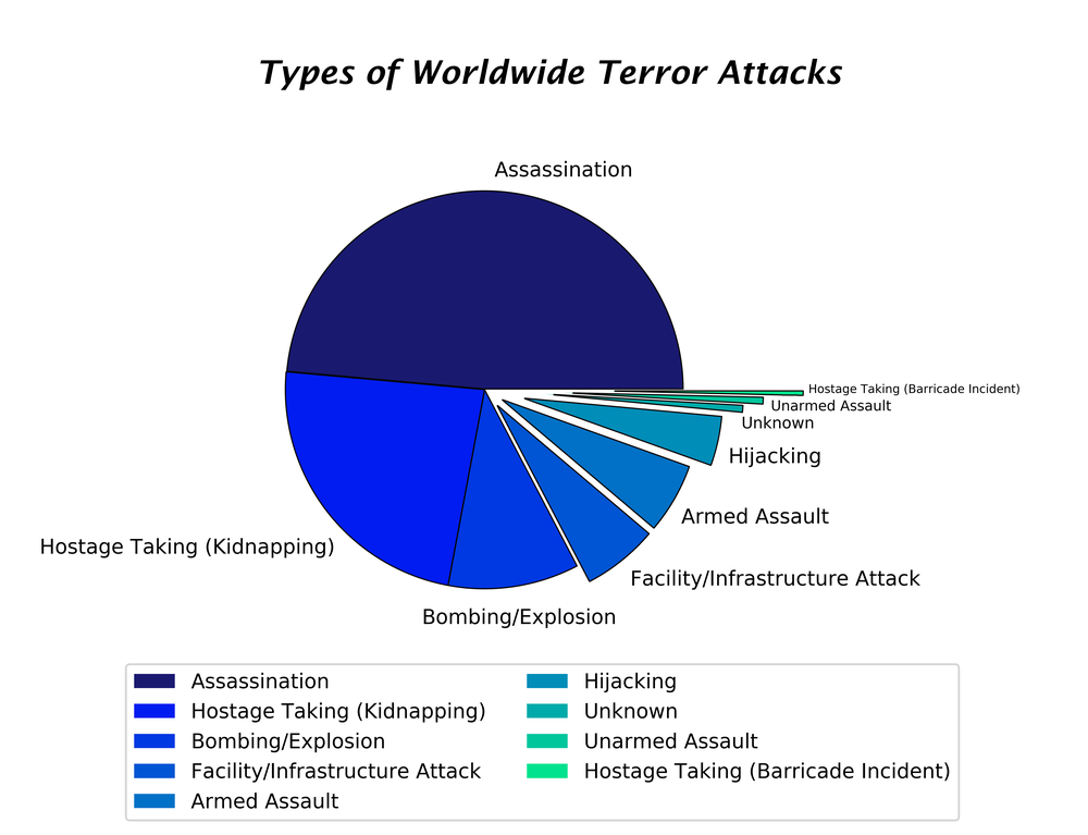
After establishing a foundation of roughly where attacks occur, the next step involves exploring the data to utilize another indicator. The pie chart in the following image depicts the proportionality of different types of attacks. While the data source has different levels of details for attack by type, only the highest-level categorization was used for simplicity. Matplotlib, another Python library, includes a technique known as “explosion” which allows for wedges to jut out.
import numpy as np

import pandas as pd

import matplotlib.pyplot as plt

from matplotlib import pylab

from matplotlib.font_manager import FontProperties

from collections import Counter

data = pd.read_excel("globalterrorismdb_0718dist.xlsx") dataframe = pd.DataFrame(data)

attack_type = data.attacktype1_txt

group_names = [] for x in attack_type: while x not in group_names: group_names.append(x)

Counter(attack_type)

counts = pd.Series([88255, 42669, 19312, 11158, 10356, 7276, 1015, 991, 659], index = ['Assassination', 'Hostage Taking (Kidnapping)', 'Bombing/Explosion', 'Facility/Infrastructure Attack', 'Armed Assault', 'Hijacking', 'Unknown', 'Unarmed Assault', 'Hostage Taking (Barricade Incident)'])

explode = (0, 0, 0, 0.1, 0.1, 0.2, 0.3, 0.4, 0.6) colors = ['#191970', '#001CF0', '#0038E2', '#0055D4', '#0071C6', '#008DB8', '#00AAAA', '#00C69C', '#00E28E', '#00FF80']

counts.plot(kind='pie', fontsize=10, colors=colors, explode=explode)

plt.axis('equal')

plt.ylabel('') pylab.legend(loc=9, bbox_to_anchor=(0.5, -0.1))

art = []

lgd = pylab.legend(loc=9, bbox_to_anchor=(0.5, -0.1), ncol=2)

art.append(lgd) pylab.savefig( "fig2.png", dpi = 700, additional_artists=art, bbox_inches="tight" ) wedgeprops = {'linewidth': 3}

plt.title('Types of Worldwide Terror Attacks')

plt.show()

When working with particularly slim slices from the pie chart, this technique allows for an easy visual intuition. Bar charts offer another option for displaying correlated groups, however, I felt as though a pie chart better exhibits proportionality.
While we have established a cursory understanding of countries comprising the lion’s share of global attacks, only a map can provide definitive answers for this case. The Global Terrorism Database stood out from other datasets because it contained longitude and latitude coordinates for every record. These coordinates are easily the most accurate geo-mapping option. On a global-mapping scale, ambiguity, incomplete names, and variation in spelling greatly constrain the ability to use other indicators such as cities and towns. Programs such as Tableau are adept at determining locations using these indicators, however, on a scale of more than 180,000 records, other approaches must be taken. In this particular case, there were still approximately 30,000 rows that the program could not interpret.
<script type='text/javascript'> var divElement = document.getElementById('viz1677532437351'); var vizElement = divElement.getElementsByTagName('object')[0]; vizElement.style.width='100%';vizElement.style.height=(divElement.offsetWidth*0.75)+'px'; var scriptElement = document.createElement('script'); scriptElement.src = 'https://public.tableau.com/javascripts/api/viz_v1.js'; vizElement.parentNode.insertBefore(scriptElement, vizElement); </script>
Comments