My journey into data science unexpectedly began around 2010 while I was working in the technology department at Direct Relief. This happened during a time when the very phrase “data science” was still in its infancy. The “department” consisted of approximately ten employees and consultants doing everything from managing the organization’s internal IT infrastructure to developing and maintaining a new SAP CRM ordering platform, launched in July of that year. One memorable aspect of working at Direct Relief was the ability to use cutting-edge technologies and applications freely licensed to the non-profit by publishers. One of the programs I could become familiar with was Tableau Desktop. A few of the consultants, far more experienced than I was at the time, were using the application to create interactive geo-dashboards for visualizing to which clinics and hospital products had been delivered in response to humanitarian crises or natural disasters.
Several years have passed since I last used Tableau Desktop and I wanted to refamiliarize myself for future posts. During last month’s Black Friday sale, Udemy and other learning platforms offered significant discounts on their courses, so decided to purchase a few covering Tableau.
After previously having worked through the future of Ukraine’s economy, I wanted to attempt a more challenging real-world application using Tableau. The inspiration behind this idea came from a book I had recently finished; The Better Angels of Our Nature by Steven Pinker. The general premise of the book argues humanity is currently living in the most peaceful period in our history. It establishes this narrative by analyzing trends in crime, death rates incurred from war, and occurrences of armed conflicts, and by compositing a plethora of other violent-related statistics.
The question this post aims to answer is whether or not humankind is living in its most peaceful period by visualizing data using different metrics relating to crime and war. The process involved with obtaining the requisite datasets was not as straightforward when compared to the previous posts. Going into this article, I was cognizant of the obvious fact that the quality of recordkeeping and data verifiability would be an issue with some of the metrics. Pinker had discussed this aspect as well; recommending a circumspect approach to gleaning too insightfully into records and statistics before the eighteenth century.
While there exist myriads of metrics to gauge tendencies in crime and violence, I wanted to examine the trend in casualties resulting from armed conflicts. The goal of this approach is to ascertain whether fatalities from war occurred at higher rates in prior centuries than they have in recent memory; namely since the twentieth century.
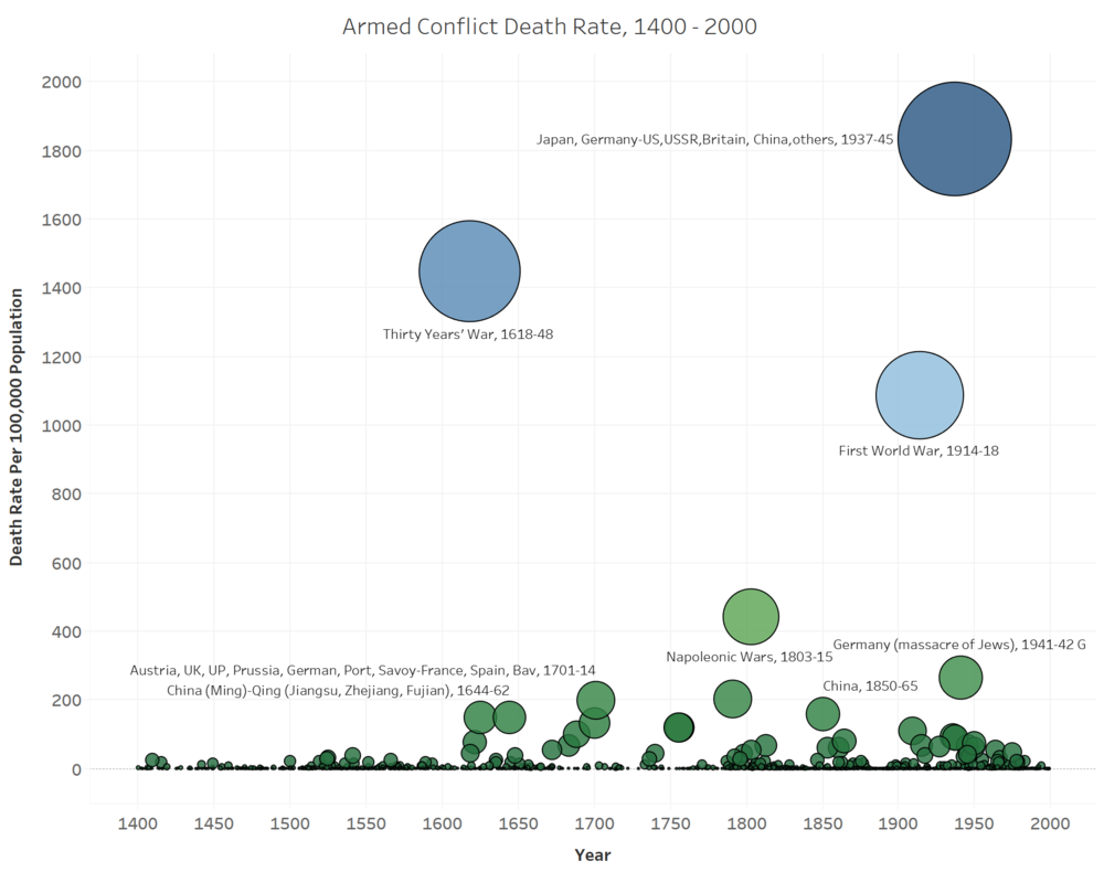
Before having delved too far into the data discovery step, I was soon to find remarkably few sources with datasets tallying military deaths before 1800. The most detailed dataset appeared to be the Conflict Catalog, labeling thousands of armed conflicts spanning 600 years. To create the visualization below with Tableau, I took the United Nations population estimates going back to 1400, divided the number of casualties by the global population at the time, and then multiplied by 100,000 to create a visual scale.

History has not always been peaceful, however, the onset of new weapons in the previous century greatly exacerbated the scale at which humans experienced casualties as a result of armed conflicts. In Better Angels, Pinker introduces us to a phenomenon he refers to as “historical myopia”, where we seemingly tend to believe we are living in one of the most violent periods on record. The relative recency of two world wars and the destructivity of their scale is one of the indicators leading to this collective illusion. While the first half of the twentieth century was aberrantly violent, it would be amiss to not consider the Long Peace which has existed since the end of World War II.
To calibrate the recent peace in numerical terms, I chose to turn to another dataset.

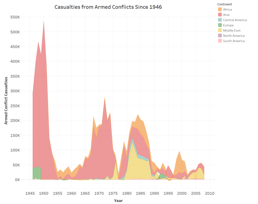
The visualization above was created from a dataset compiled by the Peace Research Institute Oslo, available here. Their data tracks casualties from armed conflicts since 1946. The trend since then has been a gradual decline, with Cold War “hotspots” such as wars in Korea and Vietnam. This rate has declined even further and remained low since the end of the Cold War in the early 1990s.
In 1995, the political scientist Francis Fukuyama published, The End of History and the Last Man, speculating that a period of post-war tranquility had begun. He argued the pinnacle of the human civilizing process had been achieved in the form of liberal democracy. In one aspect, Fukuyama was correct; democracy had recently bested communism as the world’s sole superpower. Maintaining global hegemonic norms returned to liberal democracy.
It should also be noted the occurrence of wars themselves has declined during the same period. Since the early 1990s, there are no longer rival superpowers sponsoring conflicting ideologies. Of all the current conflicts in today’s world; Russian intervention in Ukraine, the Yemeni Crisis, the Syrian Civil War, and the Iraq conflict, no two governments are formally at war with each other. That alone is a testament to the peacefulness seen today.
Although death rates from war and multistate-sponsored armed conflicts have been in a decline since 1945 and especially so since 1990, I wanted to look at another indicator. Pinker extensively discussed violent crime trends and homicide rates to determine if cities are safer than they were in previous decades.
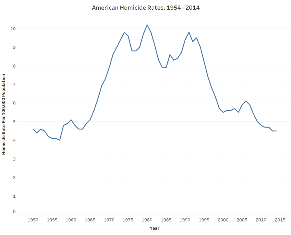
To visualize this trend, I turned to datasets from the FBI’s Uniform Crime Reporting Program. Their data tracks occurrences of murder rates from 1954 until 2014; the last year available. To create the following chart, I applied the same formula as before to identify the rate per 100,000 based on the United States population at the time.

I chose to take a qualitative approach to discuss the trend of American homicide rates before the 1950s. This is due in part to my discovery that reputable sources do not track reliably track these statistics in prior decades. The steadily increasing prevalence of law and order out west throughout the nineteenth century saw declining homicide rates. This trend continued through the Progressive Era, the Great Depression, and World War II. An upturn in murder rates did occur, however, in the 1960s, according to the FBI data above. While there is not one identifiable cause for this increase, several theories exist.
After World War II, the American population increased considerably with the Baby Boomer generation, who entered their most crime-prone years in the early 1960s. A surge in population cannot justify the increase in homicide rates alone. During the same time, however, the onset of the Civil Rights Era, the Counterculture Movement, and protests against the Vietnam War likely compounded crime rates during a time when poverty was especially pervasive. The rise of the crack-cocaine epidemic in the 1980s coincided with the increase in violence but saw a subsequent decline a decade later which paralleled the sharp decrease in American homicide rates.
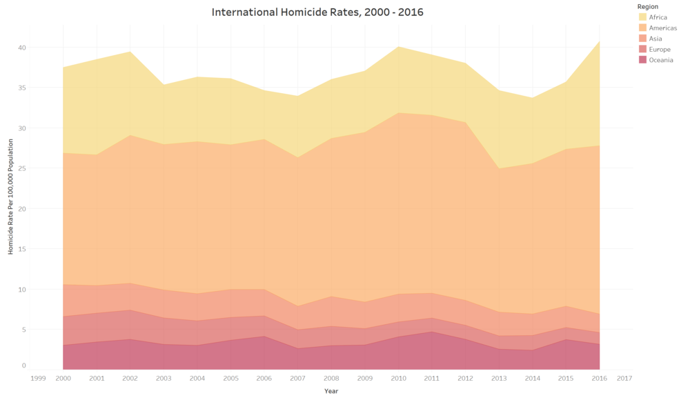
I wanted to discuss one final chart to determine whether or not correlations existed between trends in violence and geographic area. I encountered a similar situation as before, where obtaining uniform and quality datasets proved somewhat difficult. The first dozen or so datasets I found seemed to vary widely in format, timeframe, and indicators. The most uniformity came in a dataset from the UN’s Office on Drugs and Crime statistics and data portal. While their data only goes back to 2000, it offered the most statistics from every country.

To create the visualization above, I assigned countries to their respective geographic region. After some Excel formatting, the dataset was ready to analyze with Tableau. This graph tracks the incidence of homicide rates per 100,000, based on regional population changes over sixteen years. The data shows a remarkable consistency for all regions except Europe. There are minor fluctuations across all areas, including an uptick coinciding with the Great Recession in 2008-09. Despite this, most of the rates returned to around their 2000 levels by 2016. Europe is the sole exception, with a gradual yet consistent decline.
This project marked a departure from the theme and scope of the previous three posts. On one hand, using Tableau is significantly more intuitive when compared to using Python packages to create interactive visualizations. It has a much lower learning curve and arguably a more robust feature set. I did want to pick a more challenging scope for this article, however. Although we also worked with Excel files again, the data collection and discovery phases proved to be a more involved process than the accessibility and simplicity offered by the World Bank and IMF data portals.
Comments