In the previous post, we looked at changes in Ukraine’s youth (ages 0-14) demographic from 1993 to the present. The general direction was a downward trend with a slight uptick between 2010 and 2020. The UN projection for this demographic until 2040 corroborated and continued this trend.
The trend seen so far suggests Ukraine may be facing a youth deficiency in the coming years and decades. This resembles a trend similar to more developed countries such as Japan and Germany. To understand the impact of the country’s changing population as a contributing factor to the economy, it is essential to analyze all demographic changes.
For this post, we are going to look at the middle age and older demographics as well as Ukraine’s total population trajectory to gain a complete understanding of the role population will have shortly.
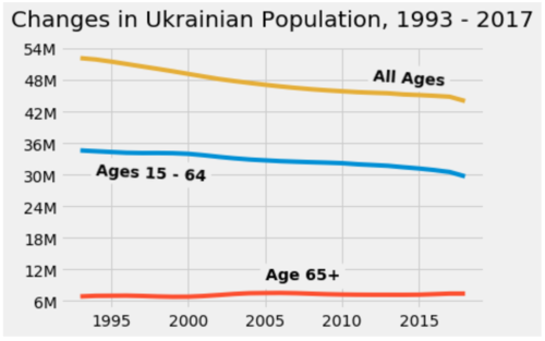
Using the same World Bank dataset from the previous post, I created segments for three new demographic categories: All Ages, Ages 15-64, and Ages 65+. We will begin by getting an idea of the changes in these three age ranges over the past 25 years, or two years after the Ukrainian Independence in 1991. I chose a new visual style to plot these segments. Matplotlib’s FiveThirtyEight style graph, modeled after the visual styles of famous statistics websites, allows us to easily look at multiple segments.
import pandas as pd
import numpy as np
from matplotlib import pyplot as plt
import matplotlib.style as style
%matplotlib inline

popdata = pd.read_csv("population.csv")

middle_pop = popdata["Population ages 15-64, total [SP.POP.1564.TO]"]
older_pop = popdata["Population ages 65 and above, total [SP.POP.65UP.TO]"]
all_pop = popdata["Population, total [SP.POP.TOTL]"]

plt.style.use("fivethirtyeight")
fig, ax = plt.subplots()
x = np.linspace(0, 12)
ax.plot(popdata.Time, middle_pop, label = "Ages 15 - 64")
ax.plot(popdata.Time, older_pop, label = "Age 65+")
ax.plot(popdata.Time, all_pop, label = "All Ages")

plt.yticks([6000000, 12000000, 18000000, 24000000, 30000000, 36000000, 42000000, 48000000, 54000000],
["6M", "12M", "18M", "24M", "30M", "36M", "42M", "48M", "54M"])
ax.text(x = 2005, y = 10000000, s = 'Age 65+', weight = 'bold', rotation = 0,
backgroundcolor = '#f0f0f0')

ax.text(x = 1994, y = 30000000, s = 'Ages 15 - 64', weight = 'bold', rotation = -3,
backgroundcolor = '#f0f0f0')

ax.text(x = 2012, y = 48000000, s = 'All Ages', weight = 'bold', rotation = -4,
backgroundcolor = '#f0f0f0')

ax.set_title("Changes in Ukrainian Population, 1993 - 2017")
ttl = ax.title
ttl.set_position([.5, 1.05])
plt.show()

The general trajectory for all of Ukraine’s population has been in a relatively gradual decline since 1993. The total population decline is happening faster than that of the 15-64 demographic because of the slightly steeper decline of the youth population discussed in the previous post. Interestingly, the older demographic has remained relatively consistent.
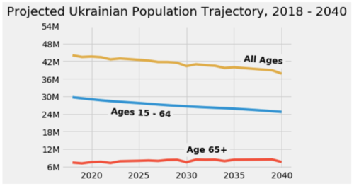
Looking to the future, we know Ukraine’s labor force is going to be smaller in the next 25 years than it was in the previous 25. To get a complete picture, however, we need to look at the total projected population trend over this same period as well.
unpop = pd.read_csv("unpopprediction.csv")

midpop = unpop["15-64"]
oldpop = unpop["65+"]
allpop = unpop["All"]

plt.style.use("fivethirtyeight")
fig, ax = plt.subplots()
x = np.linspace(0, 12)
ax.plot(unpop.Time, midpop, label = "Ages 15 - 64")
ax.plot(unpop.Time, oldpop, label = "Age 65+")
ax.plot(unpop.Time, allpop, label = "All Ages")
plt.yticks([6000000, 12000000, 18000000, 24000000, 30000000, 36000000, 42000000, 48000000, 54000000],
["6M", "12M", "18M", "24M", "30M", "36M", "42M", "48M", "54M"])

ax.text(x = 2030, y = 11000000, s = 'Age 65+', weight = 'bold', rotation = 0,
backgroundcolor = '#f0f0f0')

ax.text(x = 2022, y = 24000000, s = 'Ages 15 - 64', weight = 'bold', rotation = -3,
backgroundcolor = '#f0f0f0')

ax.text(x = 2036, y = 42000000, s = 'All Ages', weight = 'bold', rotation = -4,
backgroundcolor = '#f0f0f0')

ax.set_title("Projected Ukrainian Population Trajectory, 2018 - 2040")

ttl = ax.title
ttl.set_position([.5, 1.05])
plt.show()

The United Nations’ prediction for Ukraine’s population follows the same general decline we saw when looking at the trajectory of the youth demographic.
Population change is not inherently good or bad for economic growth. As demographics change and countries become wealthier, families tend to have fewer children. In the case of Ukraine, we can see that the 65+ age group has been the most consistent in retaining its numbers. Declining youth and productive age populations generally do not bode well for economic prosperity due to the lower projected numbers in Ukraine’s labor force paying into the system which supports the elderly. Ukraine’s society will increasingly have a surplus of retirees and less of a labor force to support shortly. This indicator is the most significant takeaway from analyzing population change.
plt.style.use("fivethirtyeight")
fig, ax = plt.subplots()
x = np.linspace(0, 12)

ax.plot(popdata.Time, middle_pop, label = "Ages 15 - 64", color="cornflowerblue")
ax.plot(popdata.Time, older_pop, label = "Age 65+", color="cornflowerblue")
ax.plot(popdata.Time, all_pop, label = "All Ages", color="cornflowerblue")
ax.plot(unpop.Time, midpop, label = "Ages 15 - 64", dashes=[4,1], color="cornflowerblue")
ax.plot(unpop.Time, oldpop, label = "Age 65+", dashes=[4,1], color="cornflowerblue")
ax.plot(unpop.Time, allpop, label = "All Ages", dashes=[4,1], color="cornflowerblue")

plt.yticks([6000000, 12000000, 18000000, 24000000, 30000000, 36000000, 42000000, 48000000, 54000000],
["6M", "12M", "18M", "24M", "30M", "36M", "42M", "48M", "54M"])

ax.text(x = 2030, y = 11000000, s = 'Age 65+', rotation = 0,
backgroundcolor = '#f0f0f0')

ax.text(x = 2022, y = 23000000, s = 'Ages 15 - 64', rotation = -5,
backgroundcolor = '#f0f0f0')

ax.text(x = 2030, y = 43000000, s = 'All Ages',
backgroundcolor = '#f0f0f0')


ax.set_title("Population Trend, Ukraine, 1993 - 2040")
ttl.set_position([.5, 1.05])
plt.show()

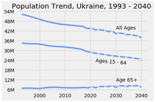
The graph above plots both the World Bank’s data on population change as well the UN’s projection for Ukraine’s population after 2018 which begins at the dotted line.
Next, we will look at more direct economic indicators such as changes in GDP, GDP per capita, and foreign direct investment to make more accurate predictions for the future of Ukraine’s economy.
Comments