After having lived in Ukraine for a year as a community economic development Peace Corps Volunteer, I decided to undertake a personal project exploring data science techniques to make predictions about Ukraine’s economy. This post is the first in a series that will feature data science approaches in a real-world application.
This post examines the change over the past 25 years of Ukraine’s youngest population demographic using publicly-available World Bank datasets. We visualize the results using the Python package, Matplotlib. Next, we use datasets from the United Nations to look at the estimated growth of this demographic for the next few decades. By using graphing techniques from two datasets, we can see visually the role the next generation of Ukrainians will have on their country’s economic outlook.
Determining Economic Indicators I want to start simply by looking at Ukraine’s population trends and trajectory. To do this, I created three segments: youth [0-14], working years [15-64], and retirees [65+]. It is not uncommon for Ukrainians to start working as teenagers, 16 or 17, after finishing secondary school. We will explore the significance of each age category on the economy and what role trends in population will have in the future. Along with the older generation, the youngest demographic of any population is economically unproductive. In the next two to three decades, this demographic will account for the most productive age range. By gaining an insight into the projected change, we understand the the impact population will have on Ukraine’s economy shortly.
In subsequent posts, we will be analyzing other indicators such as GDP, GDP per capita, migration, and investments among others.
Data Collection For an initial project, I chose to use economic data for analysis largely due to readily available complex datasets. Economic data is available from a multitude of scholarly sources; however, the World Bank’s World Development Indicators portal offers the most robust and user-friendly option for data collection. Although I have been introduced to various techniques of data scraping and connecting to APIs, I chose to get started with Excel spreadsheets.
Data Munging The World Bank portal offers intuitive export options after the desired criteria are met. I was able to export my chosen selection in a format that required minimal wrangling.
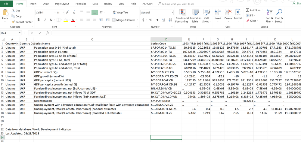
The above screenshot shows my criteria from the World Bank portal compiled into one tab. The only real task with the Excel sheet was to split the various indicators into single tabs to allow for easier munging with Python.
At this point, the population segment is saved as a single CSV file and ready for processing. From this point on, we will be conducting analyses with Python 3 using the following packages: Pandas, NumPy, and Matplotlib for graphing.
Economic Indicator: Population (Youth) Change
The first indicator we are going to study is the trends of Ukraine’s population over the last three years by creating three population buckets. We’re going to start with the youth category.
Matplotlib contains several built-in graphs such as histograms and bar charts, however, the default plot option works perfectly to provide a change in population over some time along the x-axis.
I plotted the population change for the youngest demographic of Ukraine’s citizens, ages 0-14. While this age represents the least productive demographic of Ukraine’s populace, it shows the trend since the early 1990s has been moving in the general direction of a youth deficiency.
import pandas as pd

import numpy as np

from matplotlib import pyplot as plt

popdata = pd.read_csv("population.csv")

young_pop = popdata["Population ages 0-14, total [SP.POP.0014.TO]"]

plt.plot(popdata.Time, young_pop)

plt.title("Changes in Ukrainian Population Ages 0 to 14")

plt.xlabel("Year")
plt.ylabel("Population in Millions")

plt.yticks([6000000, 7000000, 8000000, 9000000, 10000000, 11000000],["6M", "7M", "8M", "9M", "10M", "11M"])

plt.show()
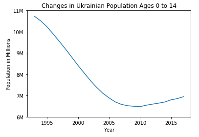
While the graph above does not bode well for the future of Ukraine’s workforce, we need to look ahead to get a better idea of the future of Ukraine’s youngest demographic.
Feature Engineering and Modeling Predictions
In the realm of data science, feature engineering refers to the ability to apply knowledge from a dataset, known as domain knowledge, to create new features to make more accurate predictions. This process is known as machine learning which uses algorithms to determine the outcome of an event.
In the relatively narrow scope of predicting youth demographic change, we would hope to utilize other indicators from our source to build a more accurate predictive model. To be able to accomplish this with any accuracy, we would need to have additional indicators such as childhood mortality rates, access to healthcare, HIV/AIDS, and disease prevalence, among other factors. If we had access to these indicators, we could likely engineer new features that would allow for a more insightful look into the future of Ukraine’s youth trajectory.
While we will cover feature engineering later in this blog, this series of posts is limited to an introductory scope. Fortunately, the United Nations provides datasets on the future of demographic changes. Their portal, the Department of Economic and Social Affairs, provides age and gender-based population projections until 2100.
unpop = pd.read_csv("unpopprediction.csv")

unyoungpop = unpop["0-14"]

plt.plot(unpop.Time, unyoungpop)

plt.title("UN Prediction for Ukraine's Population [0-14] from 2018 to 2040")

plt.xlabel("Year")

plt.ylabel("Population in Millions")

plt.yticks([7500000, 7000000, 6500000, 6000000, 5500000], ["7.5M", "7M", "6.5M", "6M", "5.5M"])

plt.show()
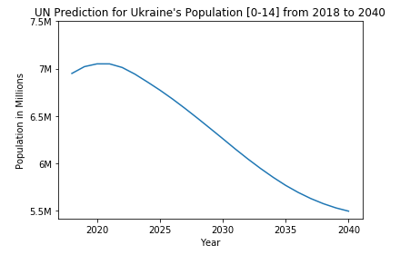
We can see from the very first graph there is a slight uptick in the youth population starting around 2010, however, this rise only lasts for about a decade before declining steadily. When we compare the two plots on one graph, we can see that the general trend of Ukraine’s youth is in a steady decline.
plt.plot(popdata.Time, young_pop)

plt.plot(unpop.Time, unyoungpop)

plt.title("Population Trend, Ukraine, [ages 0-14], 1993-2040")

plt.xlabel("Year")

plt.ylabel("Population in Millions")

plt.legend(["Population, 1993-2017", "Projected Population, 2018-2040"])

plt.yticks([6000000, 7000000, 8000000, 9000000, 10000000, 11000000],["6M", "7M", "8M", "9M", "10M", "11M"])

plt.show()
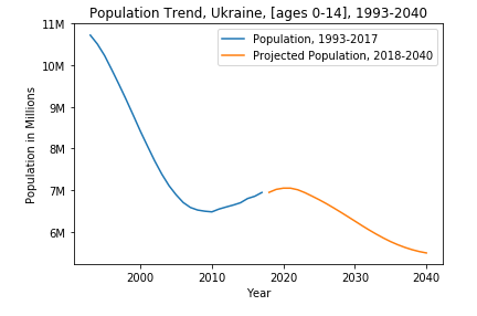
Next, we will look at trends and projections for other age categories to get a more general idea of Ukraine’s changing population.
Comments